Alabastra Cannabis
Packaging, BrandingOVERVIEW
Alabastra Cannabis is a family-owned business focused solely on the craft & quality of the cannabis plant. They are more than just a cannabis brand, they are a lifestyle brand. Alabastra was inspired by Alabaster, used by Egyptians to preserve oils and perfumes for centuries. Alabastra emphasizes the same level of care in its attention to cannabis quality and preservation for its customers.
Alabastra Cannabis is a family-owned business focused solely on the craft & quality of the cannabis plant. They are more than just a cannabis brand, they are a lifestyle brand. Alabastra was inspired by Alabaster, used by Egyptians to preserve oils and perfumes for centuries. Alabastra emphasizes the same level of care in its attention to cannabis quality and preservation for its customers.
CHALLENGE
Revamp Alabastra’s branding in a suite of fresh labels while building on their existing visual identity.
APPROACH
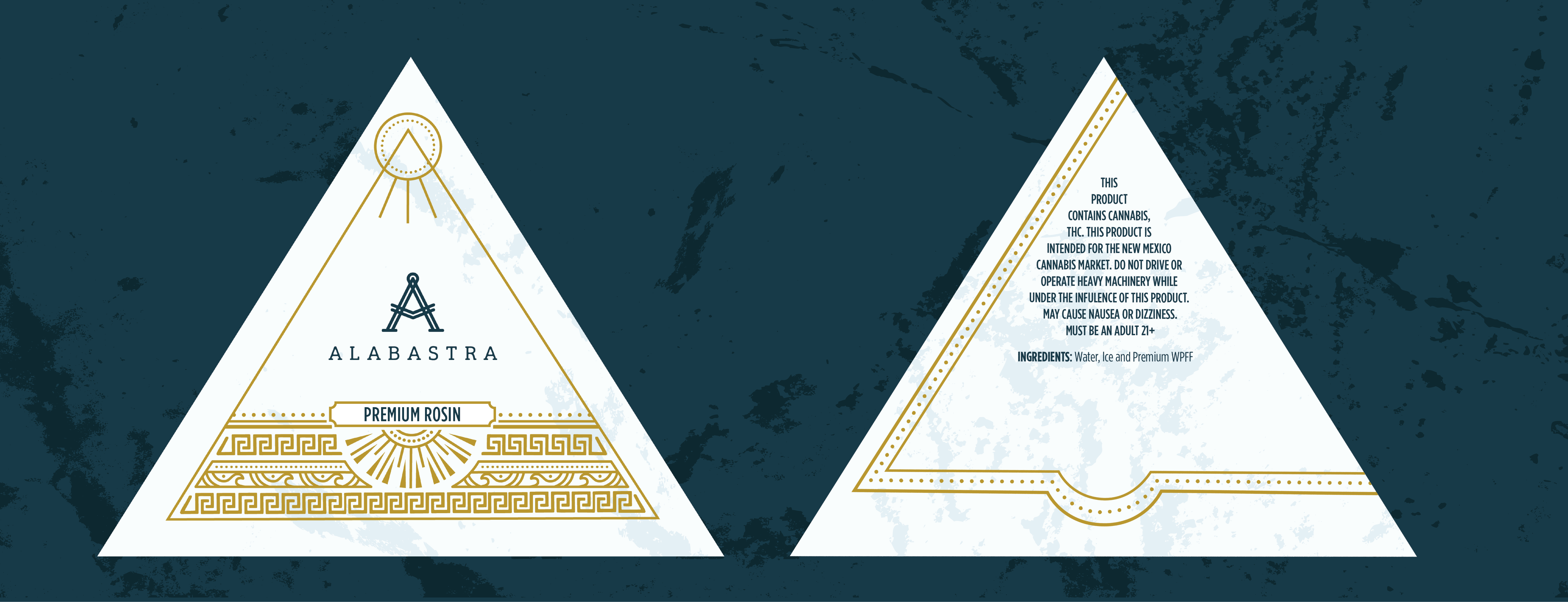
Using a custom designed pyramid box as a jumping off point, Alabastra’s rebranding leans heavily into the elements of nature as a primary theme. By applying special effects such as gold foils and gloss varnishes, this redesign evokes a luxurious feel while maintaining a cost-effective product.
PACKAGING
The visuals developed for this design were heavily inspired by the striations that can be found in stone—the subtle texture on the base mimics the organic feeling of alabaster. This gave off the all-natural feeling without needing to lean into earth tones and simultaneously appealing to the luxe and craft branding the Alabastra team desired.


PATTERNS
As the dominant visual on the packaging, the pattern shown utilizes forms found in nature such as the waves and sunbeams as displayed in the detail. This pattern also incorporates Alabastra’s key pattern to maintain brand recognition with a design that emulates visuals that could be seen in ancient textiles.

PRODUCT LINEUP
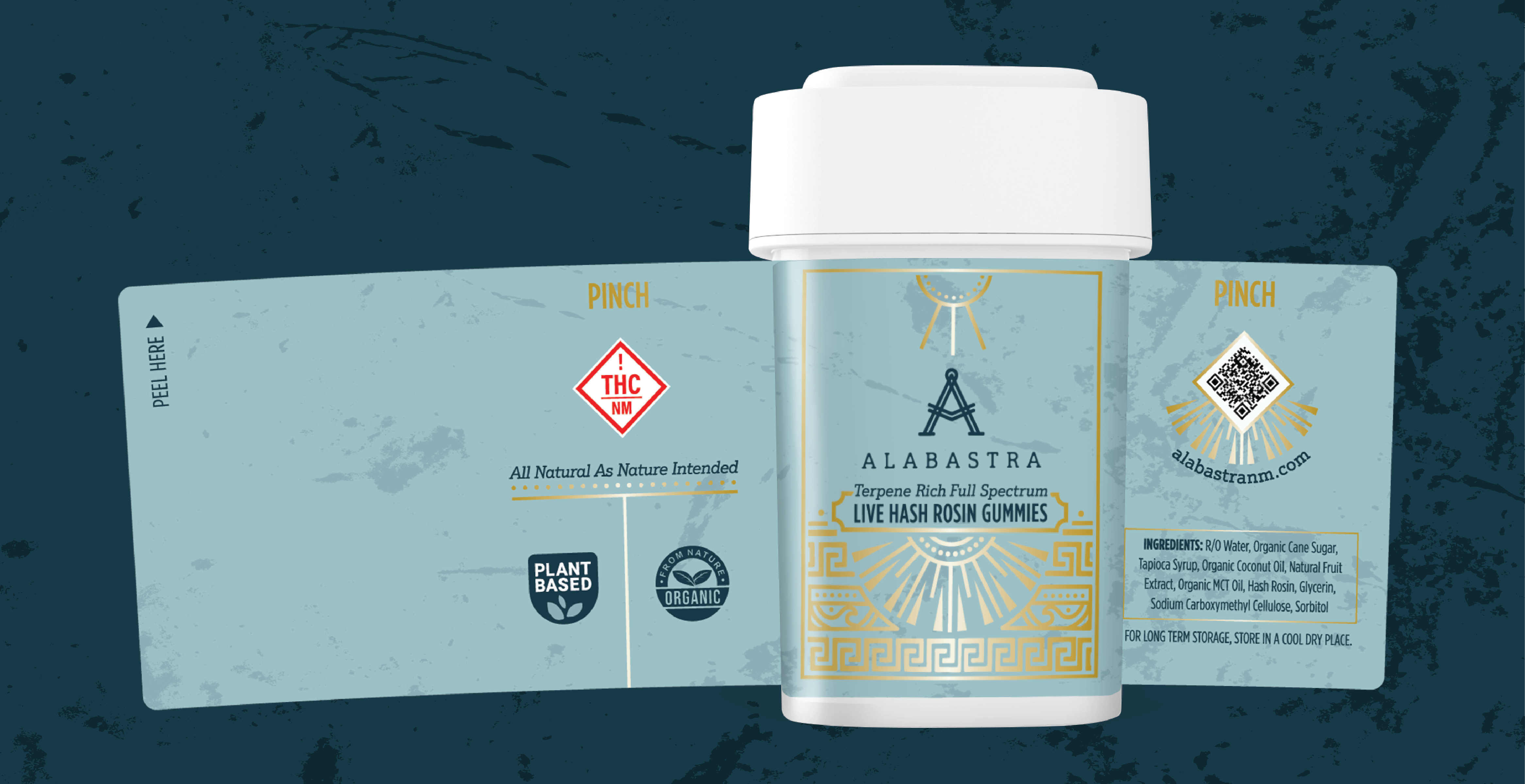
In addition to the pyramid design for Alabastra’s cannabis concentrates, they also required the design to seamlessly transfer over to the dram labels which would carry their line of edibles. By using their brand colors to differentiate each product, the continuity of the branding is carried over without sacrificing the individuality of the items within.


